
2020 Conversion Benchmark Report

Project Overview
To help marketers understand what converts and what doesn't on their landing pages, Unbounce launched the 2020 Conversion Benchmark Report in May. The project started with a simple question that’s asked time and again by Unbounce customers: “What’s a good conversion rate for landing pages in my industry?” By digging deep into the aggregate conversion data from our platform, we set out to give marketers the fuel they need to take their campaigns to the next level by delivering industry benchmarks and insights. So we rallied our data science and marketing teams, and got to work. The data in the report comes from 34 thousand Unbounce customer landing pages, including 186 million visits that culminated in 19 million conversions. We also included an AI-powered analysis of how sentiment, reading ease, and word count correlate with higher conversion rates.
The Challenge
We had a lot of data. But that’s where the real challenge began:
How do you present a tsunami of benchmarks and insights in a way that’s immediately digestible and compelling for those of us without PhDs in string theory? How do you connect the dots between abstract data points and real life customers for a marketer who may be skimming the report on her lunch break? How do you transform something as dry as a benchmark into a spur to action? And, related, how do you create a piece of content that transforms the readers into customers?
We also needed to provide the best digital experience to our visitors while making it easy for us to track their behaviour and modify the report itself through future optimization and experimentation. For this reason, we rejected the industry-standard PDF downloadable for something more robust.
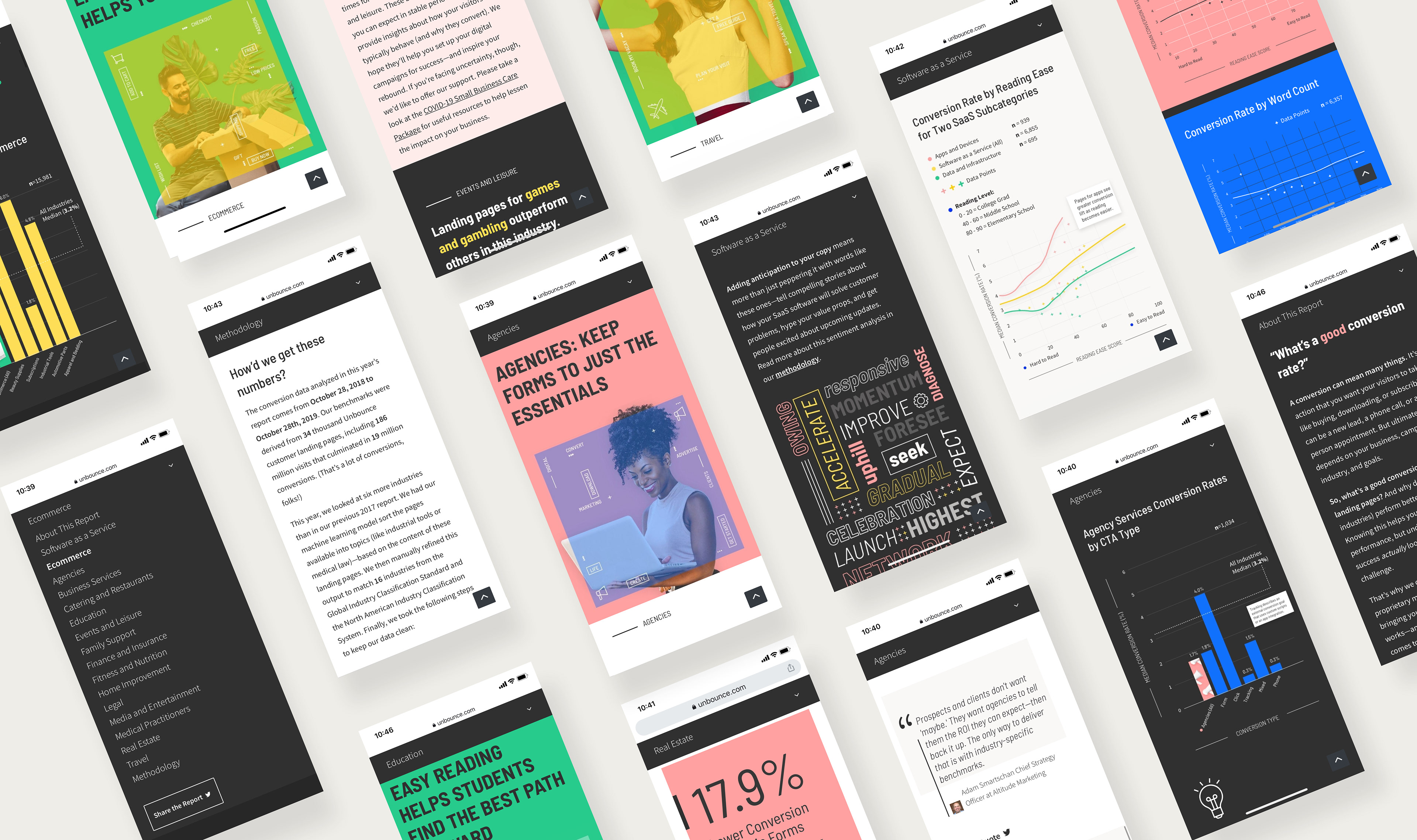
The result was an editorial microsite that showcases the benchmarks in an accessible, appealing way. Bold colours and images, hero animation, parallax effects, and table of contents (that neatly slides away) help to balance the readability that B2B audiences expect with a visual flair that grabs the reader’s attention.
Contributions
Cecilia Martinez - Art Direction, UI and UX
Colin Loughran - Content Marketing Manager
Nicole Wright - Senior Analytics Developer
And many other wonderful people (Rest of the credits at the end of the methodology)
Discovery and Exploration
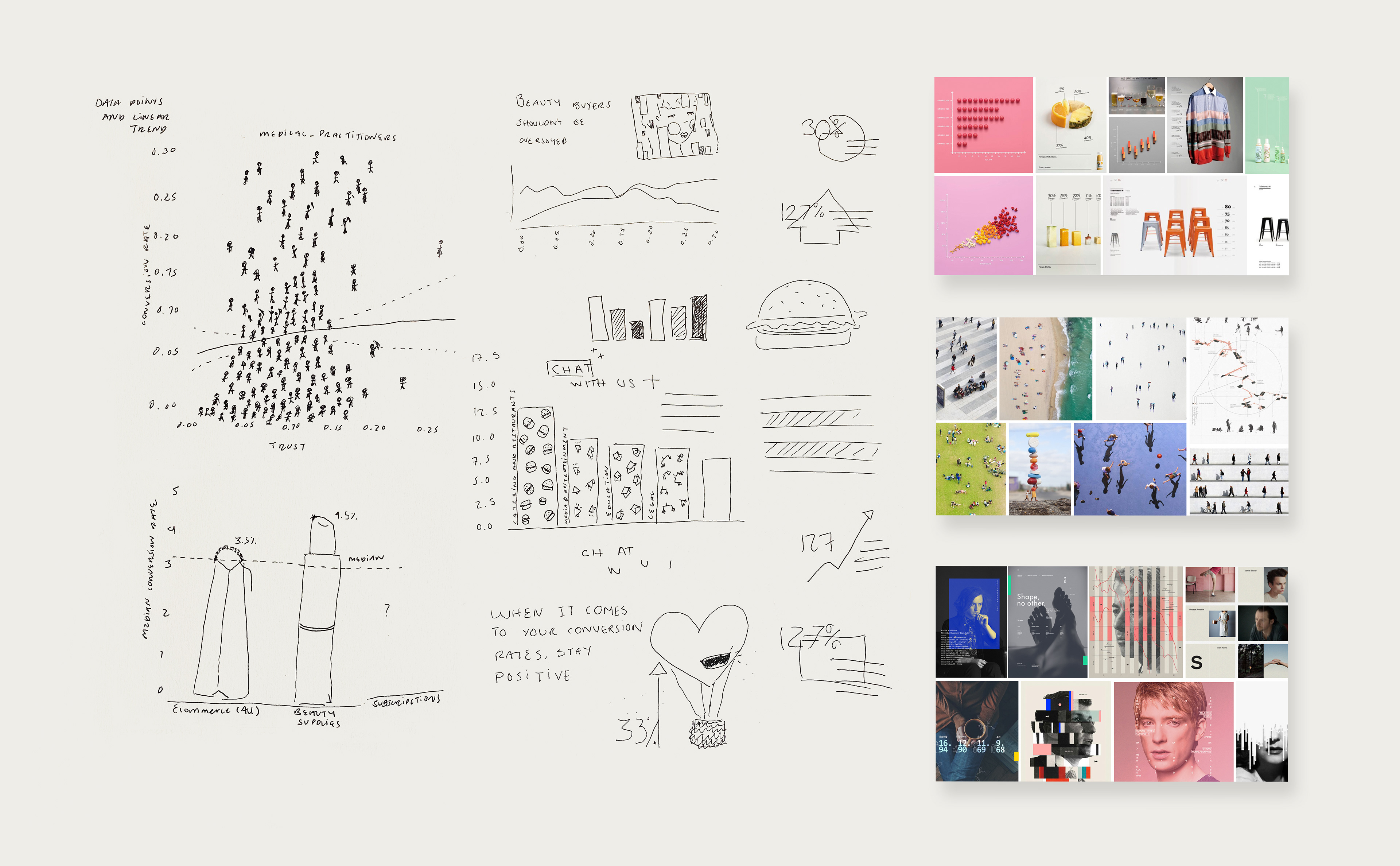
Our explorations and early mood boards sought to overcome the challenges of delivering data in a way that’s both scientifically accurate (and so, trustworthy) and engaging for an audience who may not be ready to absorb too much complexity.
Visual Concept
While we explored concepts that included a bird’s-eye-view of busy crowds or visualizing the data using objects associated with each industry, we ultimately decided on a theme that best fit the overall goals of the report: “Humans Behind Data”
This concept makes the data in the report more concretely human by featuring real faces. Data is more than just abstract numbers, after all. Data represents people and their actions. We wanted people who see our report to feel themselves and their customers reflected in it.
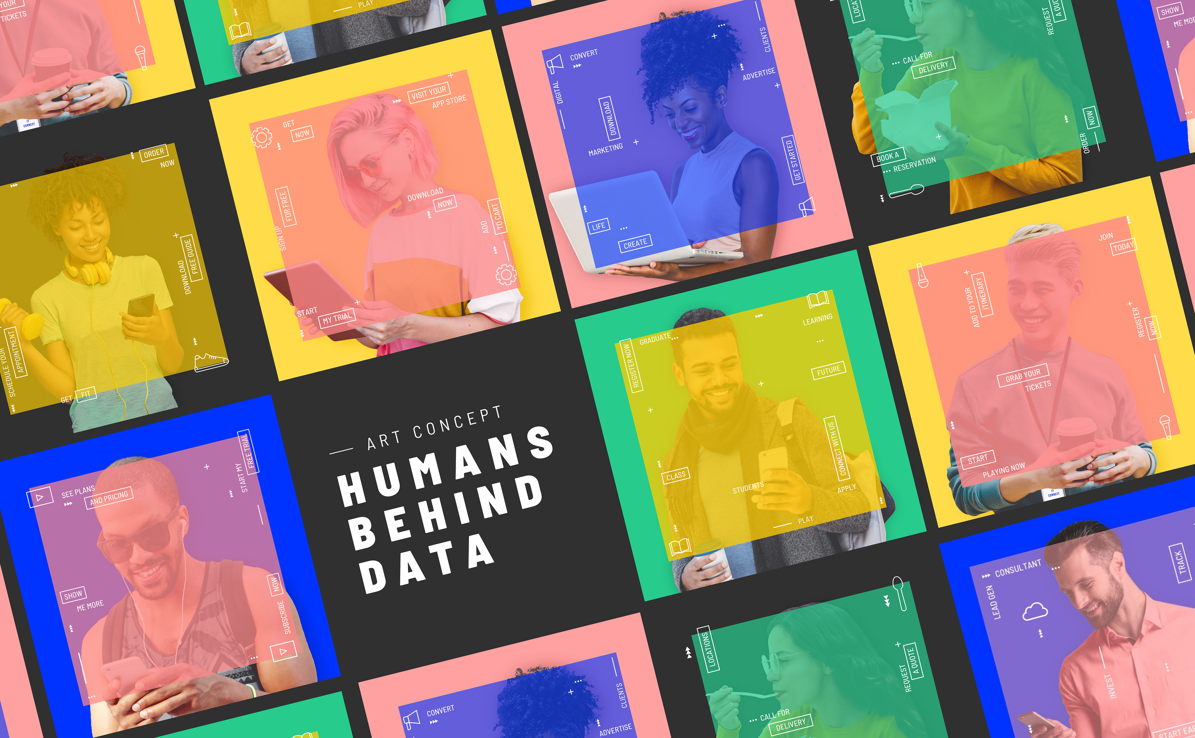
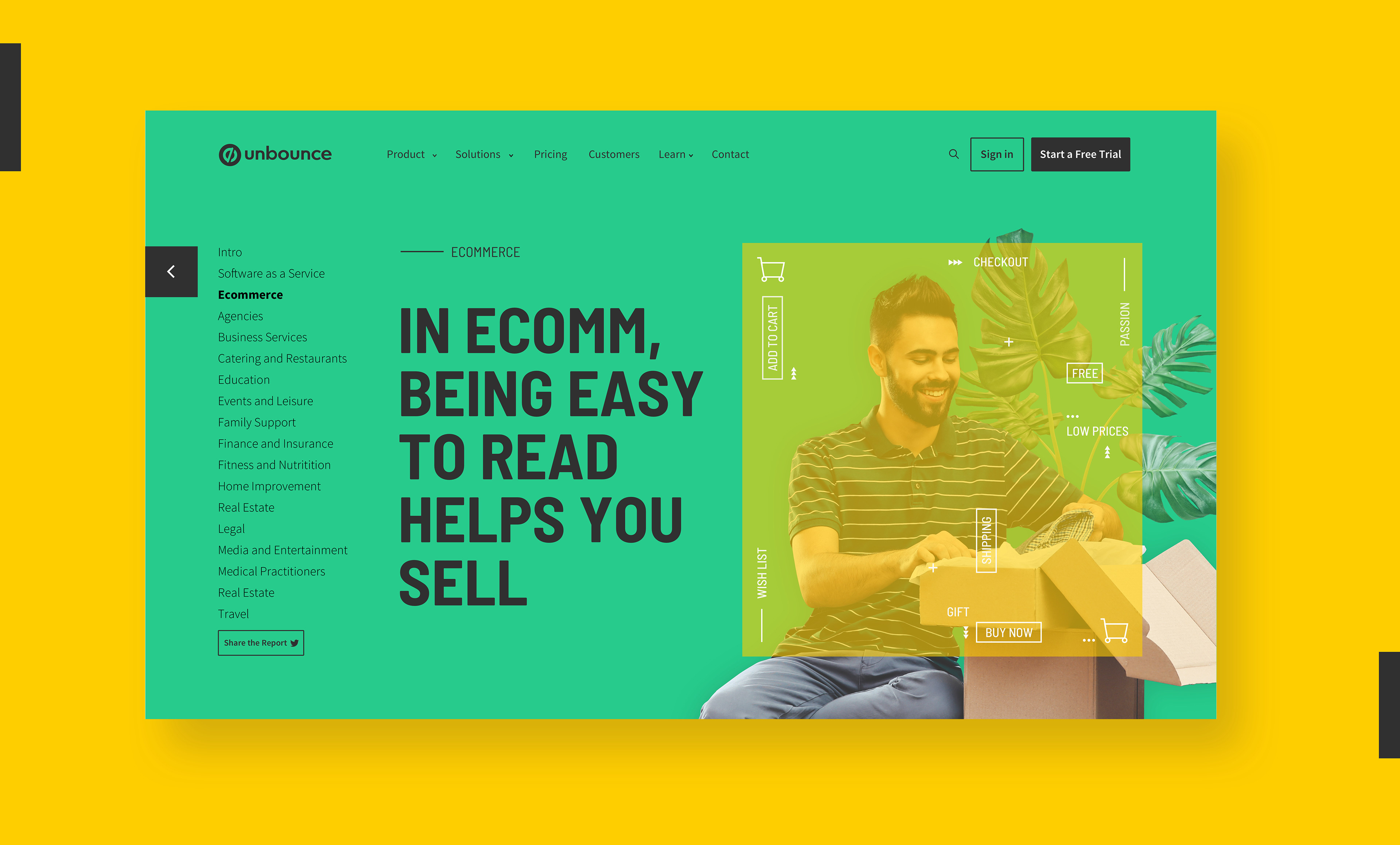
Each industry section includes a hero image with a different person representing the target customer at work or play. At the same time, additional iconic elements and overlaid graphics overlaid speak to the word and visual associations for that particular vertical.
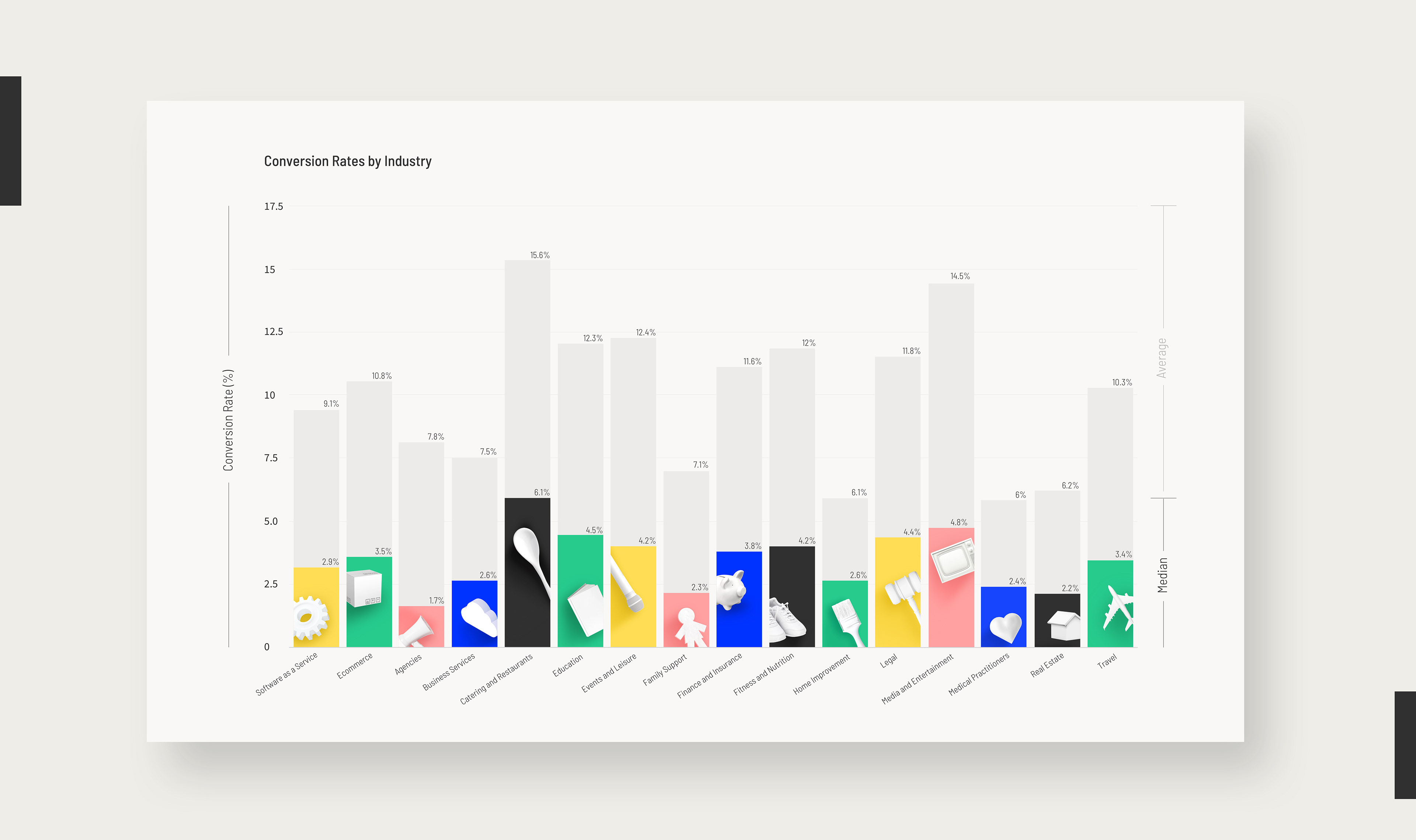
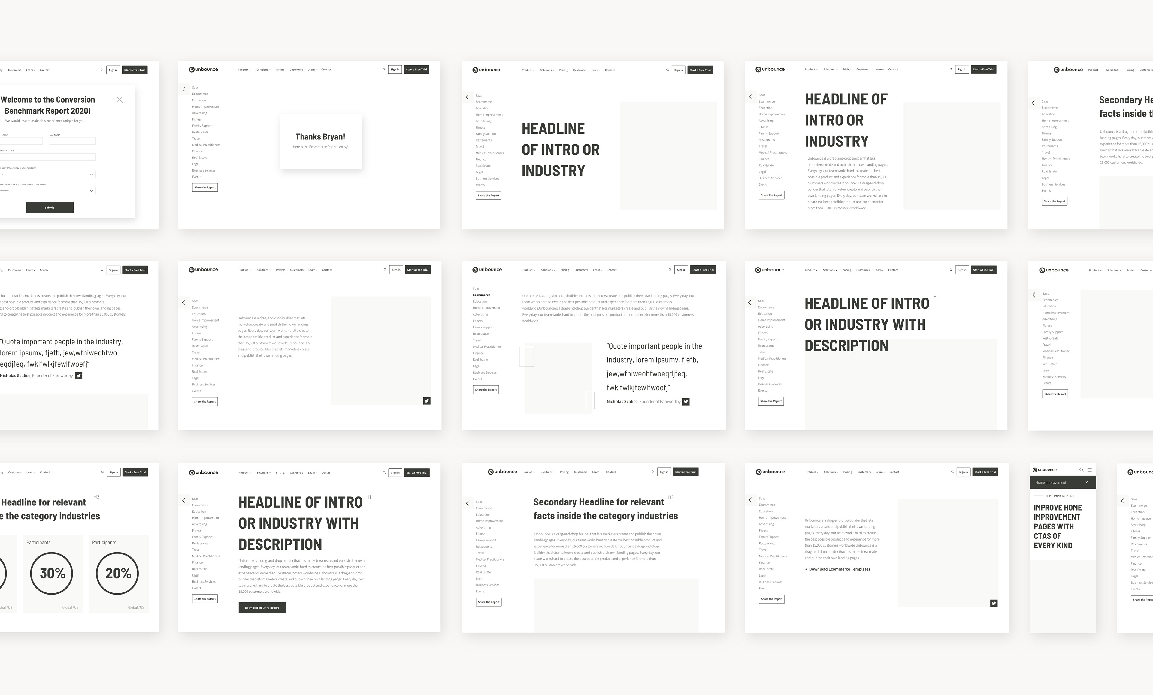
We created a “big graph” (our internal codename) as a key for the visual system of the entire report. This graph (below) shows median conversion rates for landing pages across 16 industries. It helped us assign a specific colour combination to differentiate each industry. (At the same time, these colours also play within the bounds of Unbounce’s established brand standards. It’s recognizably our own.)
To ensure the structure of the report was easy to repeat and scale, between design and copy, we thought about all the blocks we could use for this piece and named them. The next step was for the writer to use the blocks while defining the story and data analysis for each industry. Below, you can see the wireframes for all the blocks and the ones we selected for the SaaS industry. Using the "big graph" as a reference and the blocks above, we used yellow as the primary color and pink as the secondary, following our brand colour combinations.
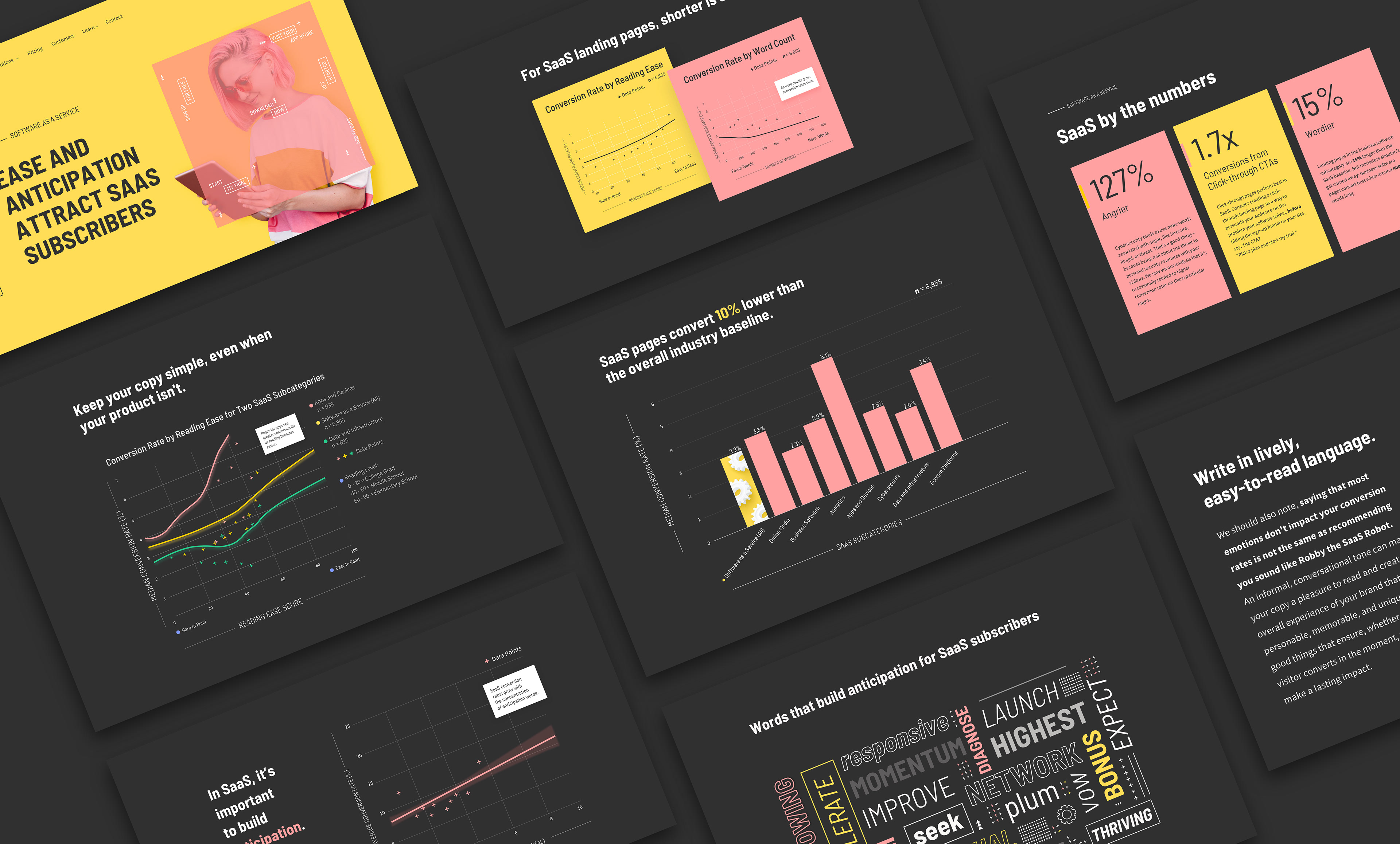
The most important graph for the SaaS industry is the one labeled "SaaS pages convert 10% lower than the overall industry baseline." (For the skimmers, all our graphs were titled using the major takeaways from each section.) We used the same iconography (a gear) and colour (yellow) as the “big graph” to represent conversion rates for all SaaS companies, then broke it apart from the subcategories (like “Cybersecurity”) that readers can quickly absorb.
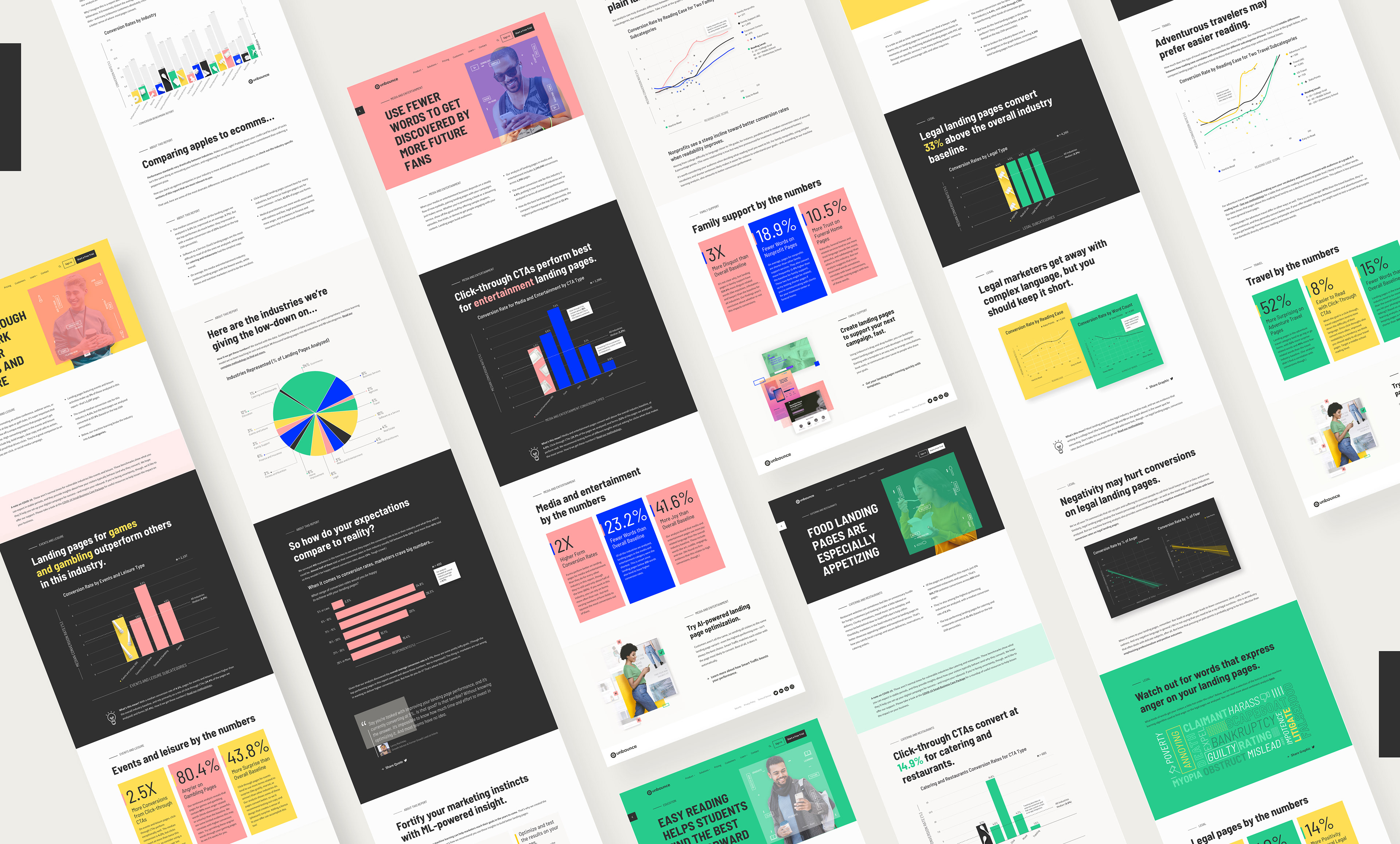
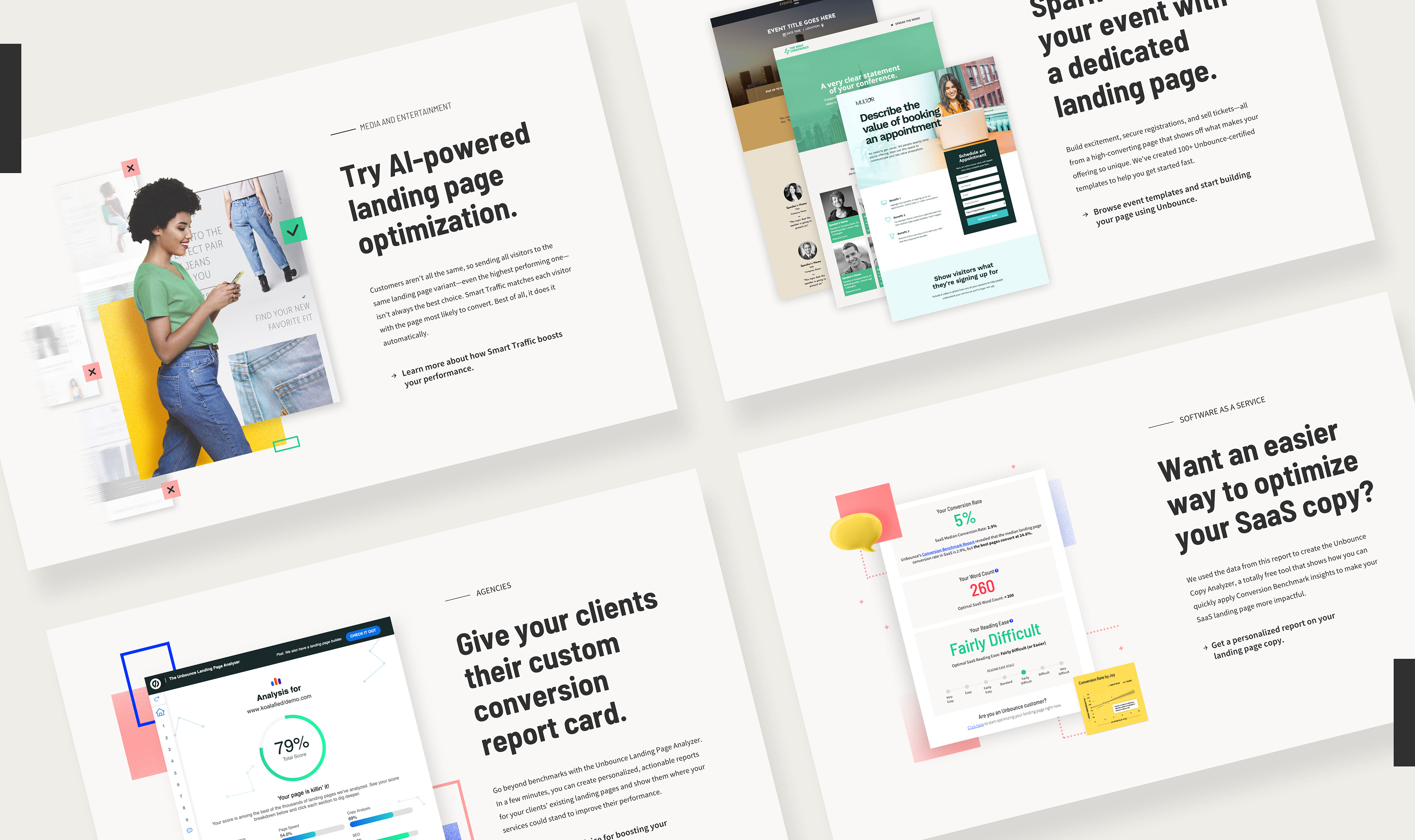
Through the report, we added call to actions to some of our most high-converting web pages, which we added with the intention of keeping a buying flow where users could navigate and take action after reading our insights.
We evaluated colour contrast and the legibility of our charts through many impression tests with marketers from different backgrounds. The report is also responsive and easy to access via mobile for marketers on the go.
The Results
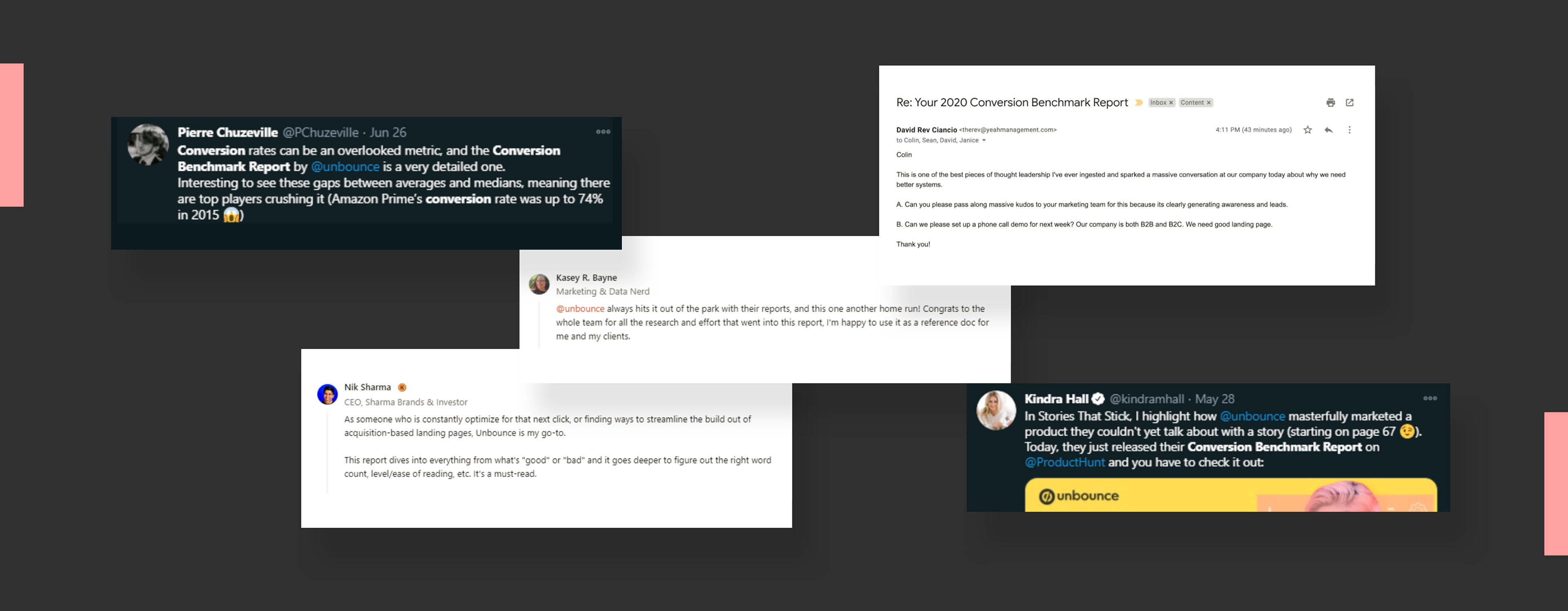
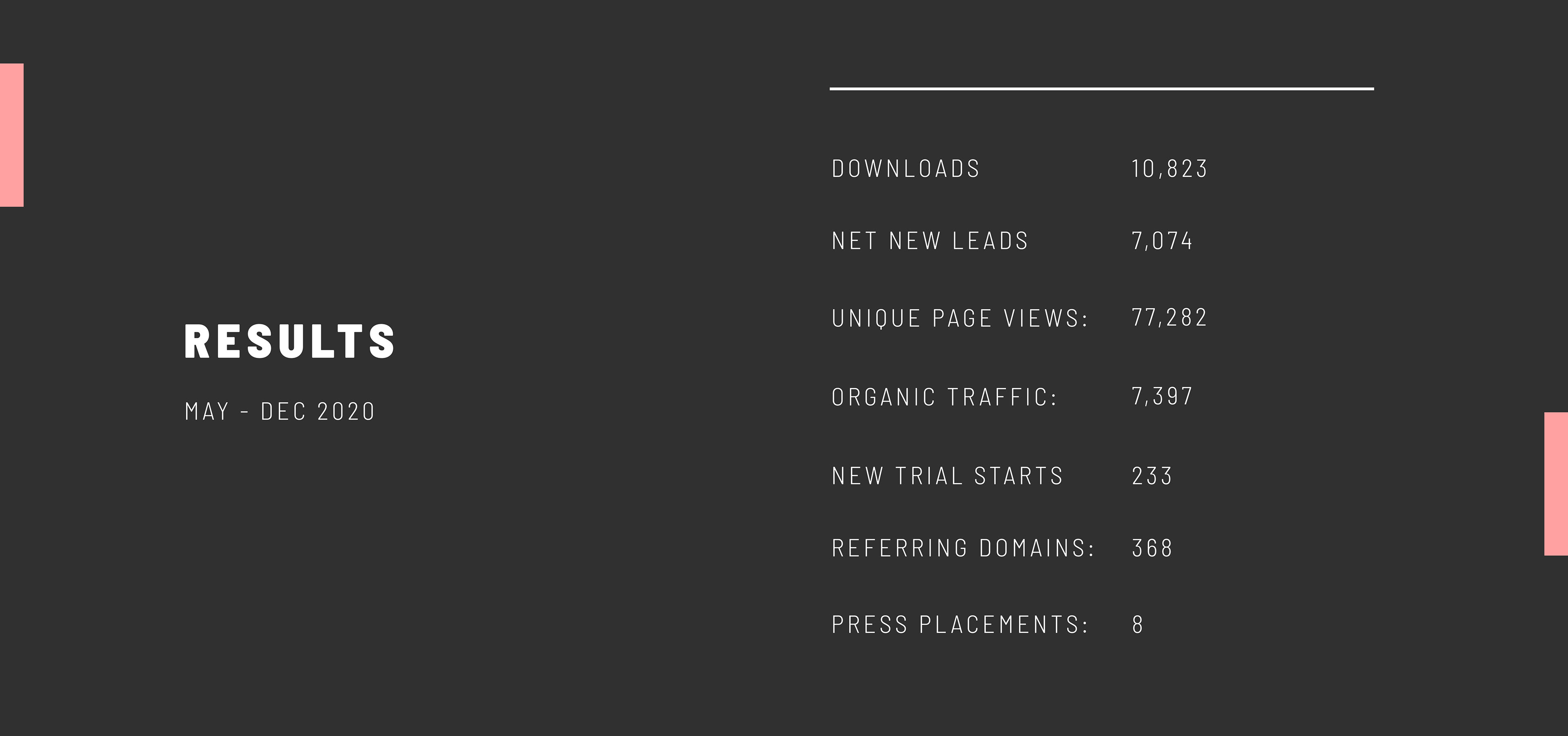
The Conversion Benchmark Report smashed every target we set based on a history of publishing gated content. In the first 90 days, the report was accessed by 6,303 different readers (generating that many leads) and has been seen by more than 40,000 unique visitors. It secured hundreds of backlinks, won press coverage, and continues to drive organic traffic in addition to the paid campaign we continue to run.
Thank you!
Check out full report here.