
Unbounce Website Redesign
Project Overview
Unbounce is a landing page platform which purpose is to help the world experience better marketing. Early 2019, the company decided to restructure and redesign the Unbounce website to have it aligned to our new branding and new segments: eCommerce, Saas, and Agency.
Contributions
Cecilia Martinez - Lead Designer, Art Direction, Web Strategy, UI/UX,
Jennifer Pepper - Content Lead
Dos Lados- Website Strategy
Hayley Mullen, Luke Bailey - Copywriting
Sabrina Chan, Carolyn Laihow - Designers on Phase II pages
Leslie Ty - Project Manager
Cody Campbell - Content Strategy, SEO
Sam Chen - Web Developer
Discovery Phase
Finding Problems and Opportunities
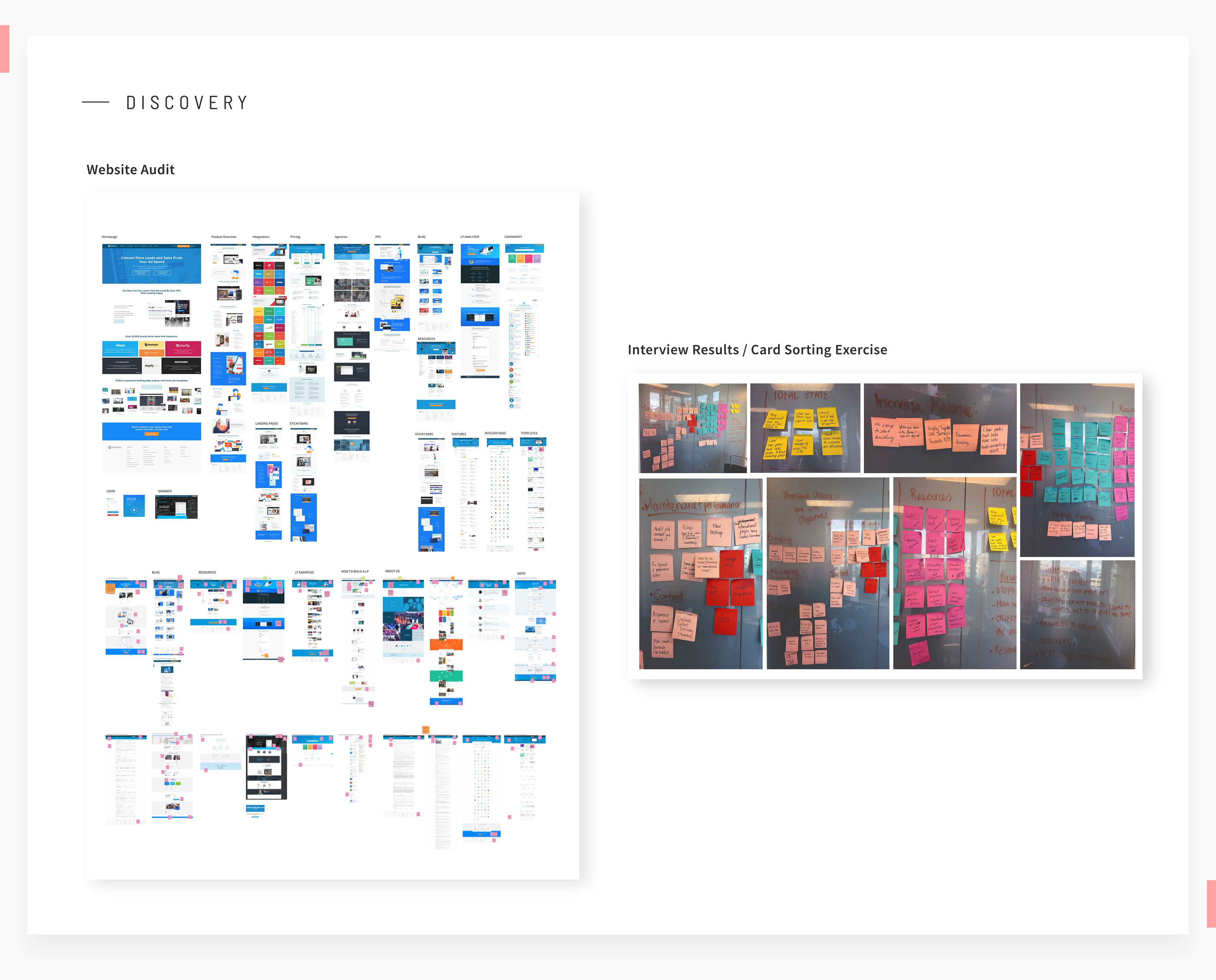
To get started we looked into different things: website performance, an audit of all pages, which ones were the pages that had more visits and more conversions, and which ones didn't. We reviewed heat maps to see how much people were scrolling down, and what they were clicking. We interviewed senior managers and leaders in the company to get their perspectives on the Unbounce website.
From the interviews we were interested in learning:
• What are the current challenges on Unbounce.com and other web properties
• What is working right now
• How the content strategy can impact the website
• What is the ideal state of unbounce.com
• What are the top three kpis the website could impact
Planning and Strategy
Problems to be solved
• The website is slow
• Tracking of the funnel is not in place, it's hard to make experiments
• Many leaks in the first visit to NTS funnel
• Inconsistent user experience
• Inconsistent brand
• We depend on developers to create new content
• Tracking of the funnel is not in place, it's hard to make experiments
• Many leaks in the first visit to NTS funnel
• Inconsistent user experience
• Inconsistent brand
• We depend on developers to create new content
Benefits
• A faster, lighter, cleaner functional site
• Improve content discovery at all stages of the marketing funnel for our different segments
• A cohesive and consistent look and feel between all web properties.
• Clear messaging across the site where visitor understands what and who we are.
• Align all content and make it easily searchable.
• Make pages more accessible through Mobile
• Effective Self serve for internal teams to update content & pages
• Improved analytics, attribution & customer tracking
Objective
Create an effective desktop and mobile evaluator experience, focus on our three segments: eCommerce, Saas, and Agencies, which can help us increase NTS, collect leads and tell the story of how our product will benefit each industry. Provide an easy user experience in the website CMS for Marketing to control and add content to the site without depending on developers.
Information Architecture
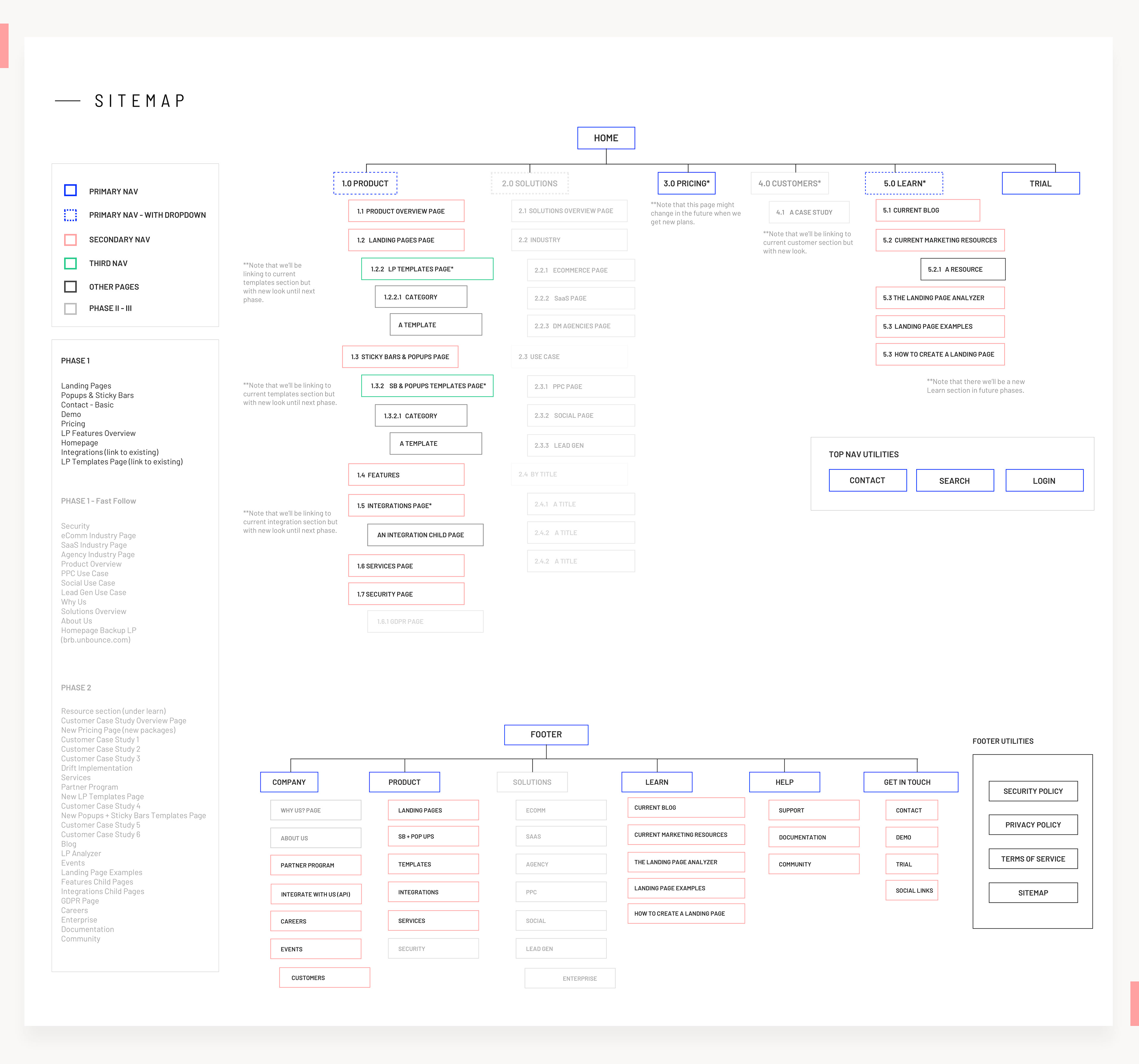
To establish the information architecture of the website, we had to consider what was the most relevant content for our visitors and help them find faster and better answers to their questions while evaluating us, then think on what are the jobs we wanted them to do such as trying our product or get assistance from the sales team.
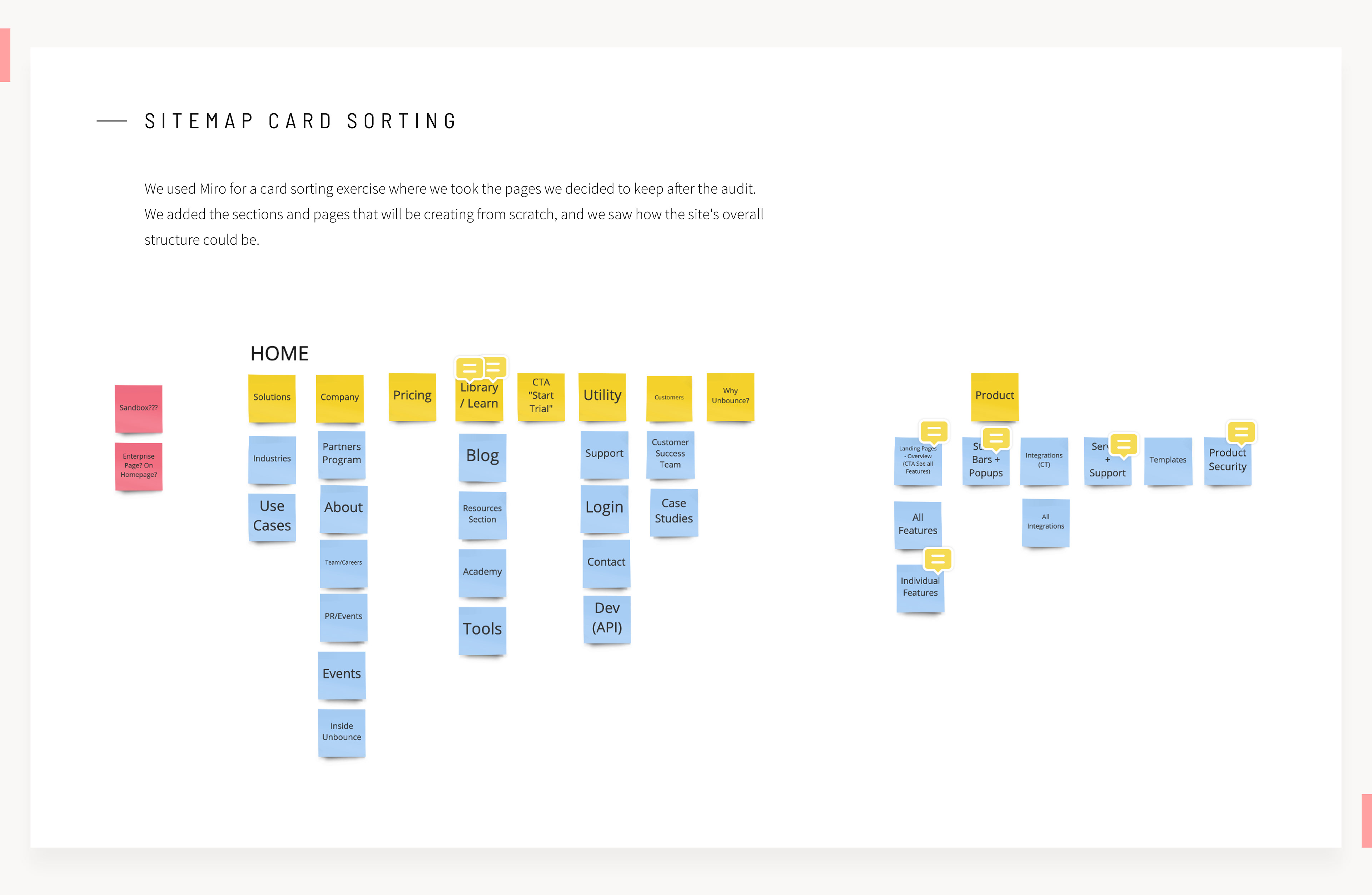
The Sitemap was great to communicate overall the changes that were gonna be done to the website structure. It is visualized in a way that communicates which sections or pages were gonna be built for the phase I launch and which ones would be done for the next phases. This allowed us to manage expectations with stakeholders and the rest of the company.
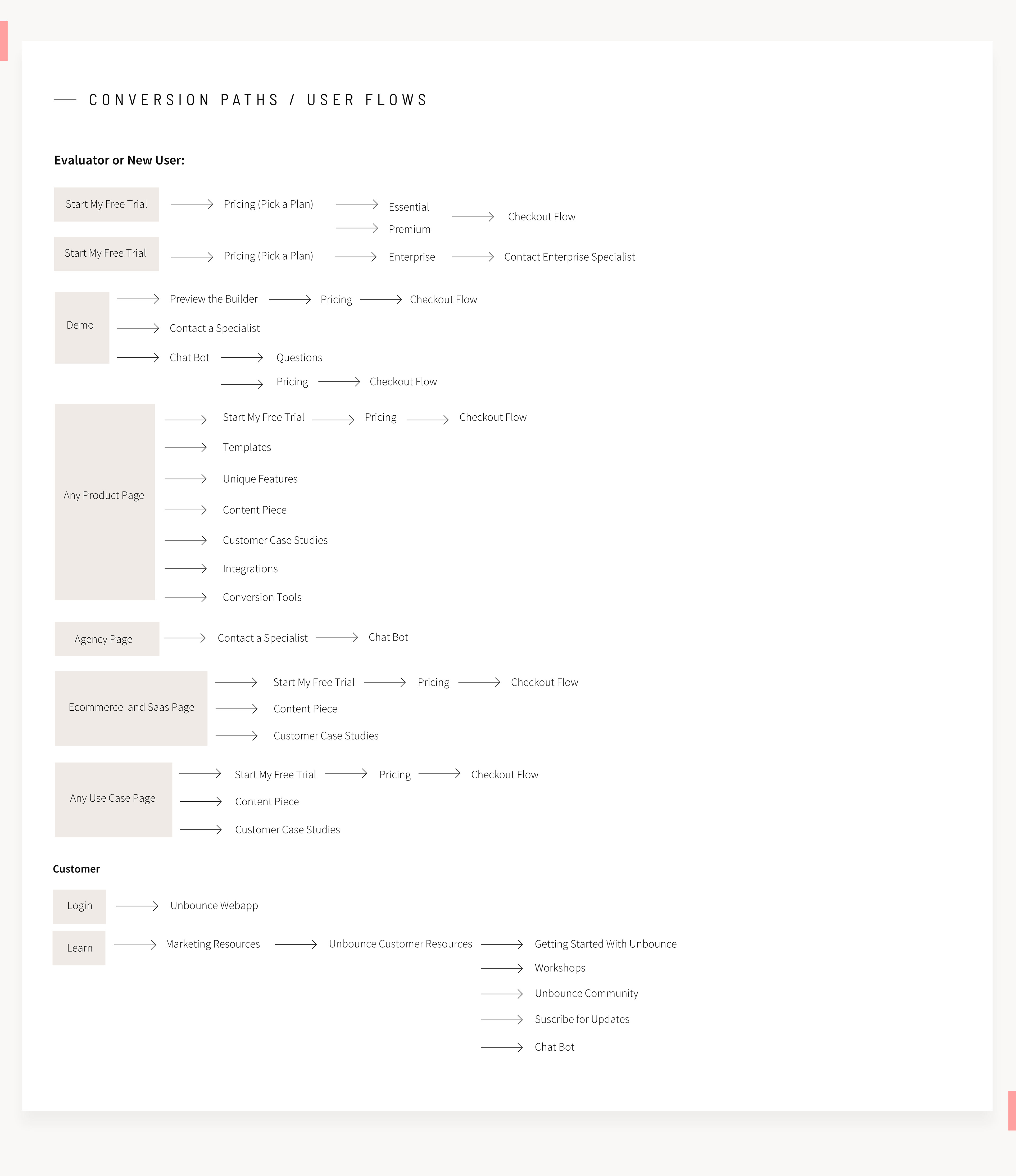
Conversion Paths
Once the sitemap was established, we had to create conversion paths for our evaluators, decide the key pages we wanted them to visit, and the next steps to be able to convert into a lead or New Trial Start.
Testing
We planned ahead of time the different tests we would require to validate our first concepts and drafts that would help us know how to proceed when making decisions on the layout and structure of the website.
Goals:
1. How visitors would react to a new nomenclature on our navigation. Also to know what was the content they would be expecting to find under each nav item if it was clear or confusing.
2. Understand the reactions visitors will have when seeing our new visual brand applied to the website.
3. Understand if visitors could understand our product and key messaging now that we were applying a new tone and voice.
4. Would a change in our global navigation affect our conversions?
Tests we implemented:
1. Nomenclature / Content Expectation / Global Navigation Layout test
2. A/B test in global navigation (Executed by the product team)
3. Impression tests with mockups
2. A/B test in global navigation (Executed by the product team)
3. Impression tests with mockups
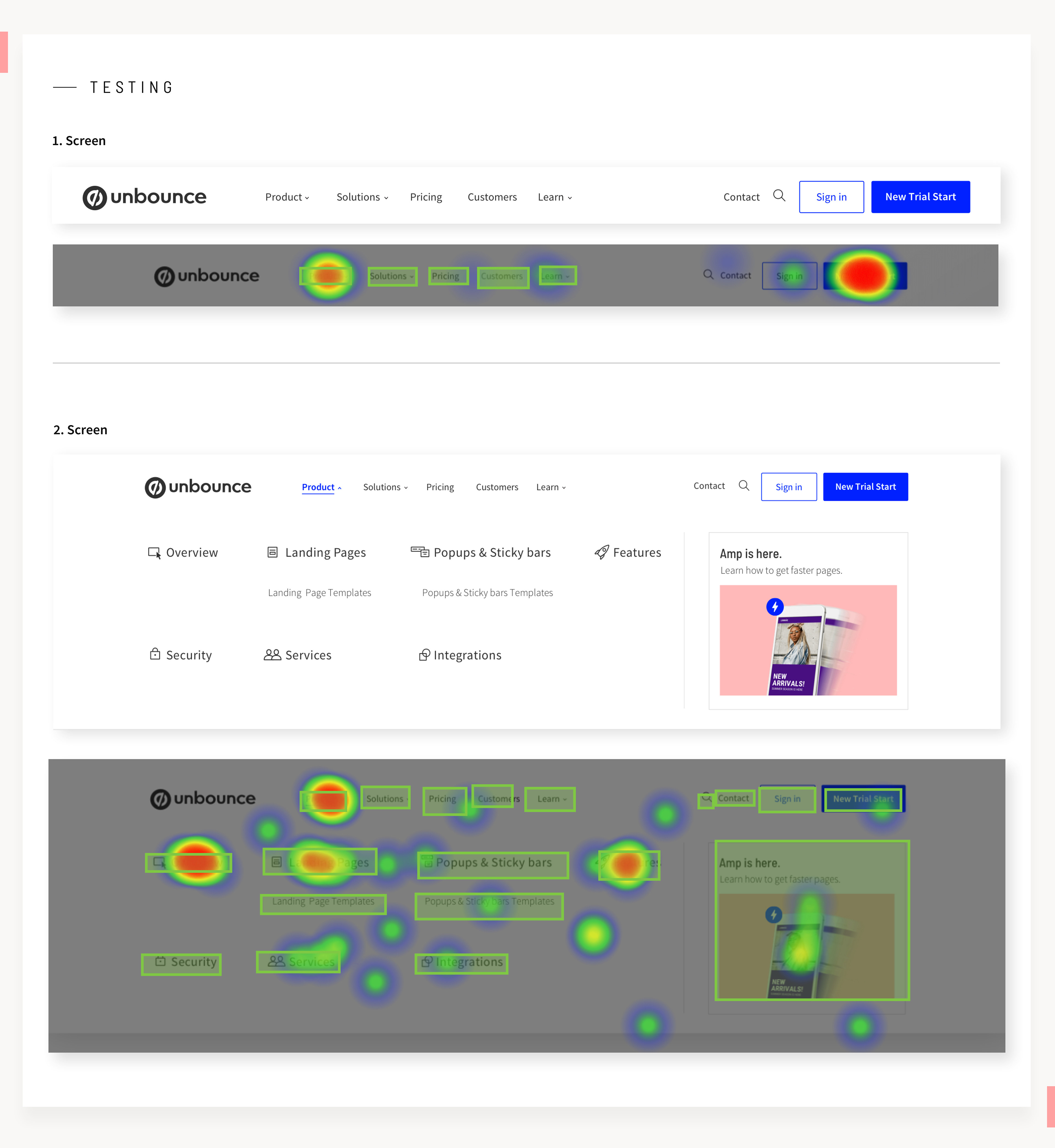
Nomenclature Test and Content Expectation in Global Navigation (50 participants)
With Usability Hub, we tested our new proposed nomenclature and user expectations. Our goal was to understand if users could navigate our website to evaluate our product with limited knowledge of Unbounce. We presented one first screen with the website global nav, without any other context followed by open questions to get more information on what people were expecting to find after clicking any element.
Then we shared a second screen with the drop-down menu for the Product section, followed by open questions to gather more information on the sentiment people had about the layout and the terminology.
Then we shared a second screen with the drop-down menu for the Product section, followed by open questions to gather more information on the sentiment people had about the layout and the terminology.
Findings
• Most participants understood our categories and what was under each title.
• Few participants throughout the test had a challenging time. They struggled to understand the difference between product and solutions, it got clear once they open the menu and saw the sub-navigation.
• All signals at this time are pointing to a clear and functional structure.
• Further validation was done during a A/B test in our global nav using the old website.
Storytelling and Wireframes
The way we approach wireframes was by creating blocks or components. We focus on making the site easy to scale in the future and for this, we created flexible blocks that could be reused over and over no matter what was the purpose or intention of a new page.
To get to this, first, we decided on the hierarchy of the content. We used the following framework (product positioning):
• What is the problem statement?
• How are we prioritizing the different problems?
• What are the solutions?
• What are the benefits of using our product?
• What is the main message we want our audiences to get?
• How are we prioritizing the different problems?
• What are the solutions?
• What are the benefits of using our product?
• What is the main message we want our audiences to get?
That framework allowed us to explore different ways of telling the Unbounce story. That would allow us to select the blocks that we could use to start building the pages. To create as many blocks as possible we decided to start with the Homepage, one product page (Landing Page Builder), one segment page (Agencies), and one use case page (PPC).
We paired designers and copywriters for a wireframing session, the teams got briefed on the product positioning for the different pages that we were gonna base the blocks. The different pairs not only brainstorm the structure but the story flow of each page with different options, and what could be potential visuals to support the copy.
Refining Wireframes
Once the main elements got selected for our different purposes, refining wireframes was pretty fast for mobile and desktop. In this phase, it became clear how many components or blocks had to get built. We briefed the web developer, for him to get familiar with the blocks and get an estimate of how long it would take to create them. We used Miro to show all wireframes and get approvals from stakeholders. We divided revisions into phases to keep control of feedback and scope.
Call to actions and links to go from one content page to another were placed according to what we thought was the best next thing to improve the experience for any visitor or evaluator. It could be from being ready to start the free trial and check pricing to keep exploring product pages or Marketing content; there would be a link to take them towards any direction they would prefer.
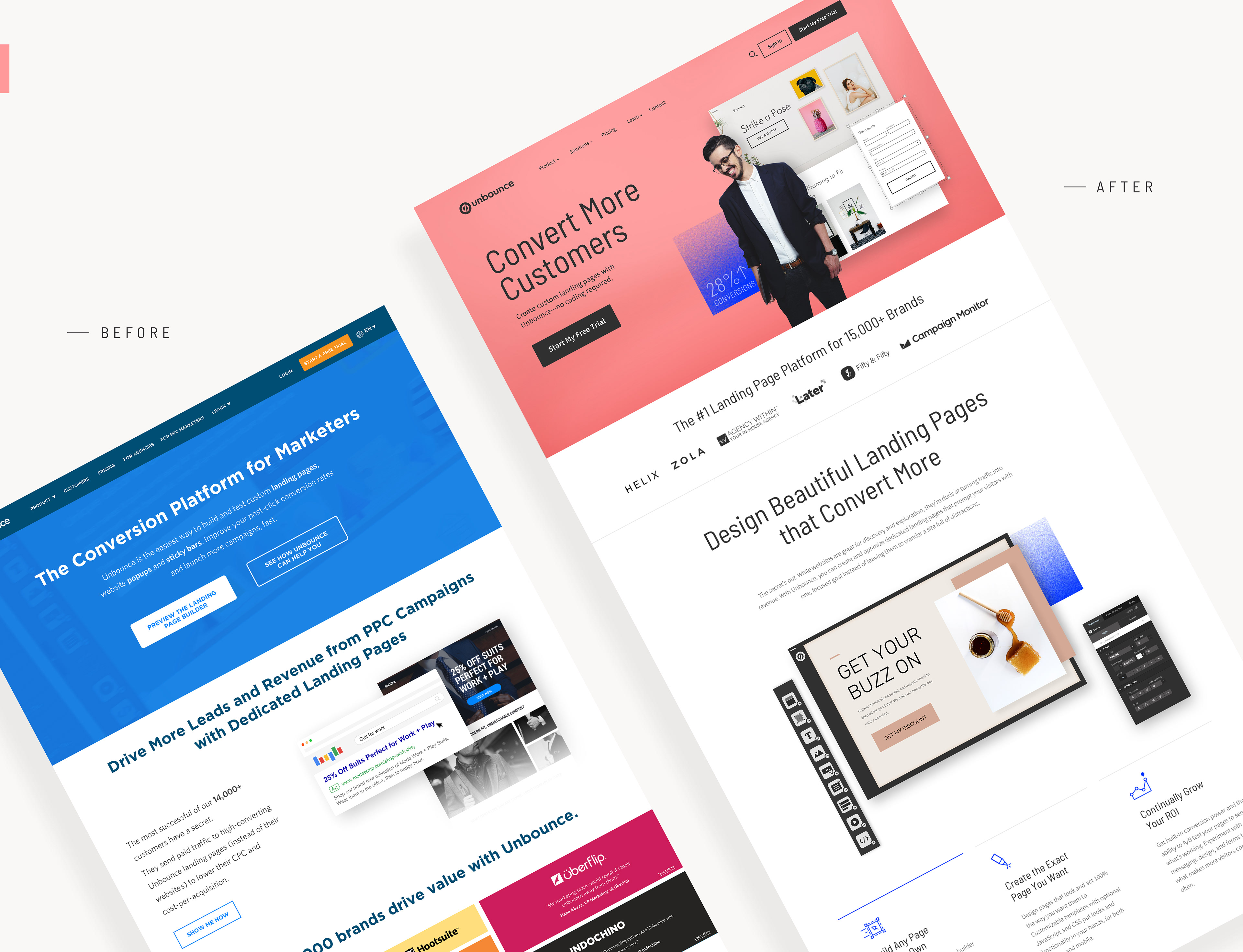
Website Art Direction
Parallel to the website project, we were working on the Unbounce brand refresh. Part of it was to create a new brand personality that can guide us not only in our look and feel but also in our tone and voice. Having our brand personality helped us make different decisions throughout the website on how copywriting and visuals together could carefully deliver our message to our diverse audiences in a clear and meaningful way.
Every example we used to represent Landing pages, Popups, Sticky bars, or the builder, was carefully created in a way that it could represent the different industries that we are targeting, so when people visit our page they can feel identified with the content.
eCommerce, Saas, and Agencies landing pages helped inspire the design of the examples created, always having in mind that they needed to be real and show that they could be done by any marketer in our builder.
Something else that was carefully decided was not to go for illustrations representing people or our software. We studied different brands and competitors noticing the strong trend that illustrations are having in the Saas Industry, so as part of our new branding we focus on the "Humans first" approach which goes very tight with Unbounce's focus on the customer first.
To achieve this, we decided to have a photoshoot instead of stock images, to get the look and feel we wanted, which was to make it real, human and portray the different styles and diversity that we have among our customers belonging to different industries.
Finally, for our product, we decided to make it easy to digest at first glance, so we remove some elements that would create noise when someone is evaluating our product for the first time. But we kept the essence of it and we also divide some of its components to make it easy to explain some of its functionalities with the use of animations.

Impression Test (50 participants)
The new website was launching a new look and feel and tone and voice, before moving forward with development we wanted to ensure people were having a positive reaction to the new changes.
Goals for Screen A (Landing Page Overview Page) and Screen B (Ecommerce Page) / 5 seconds each
• Do they understand what Unbounce can do for them?
• Do they understand the primary benefit of using Unbounce?
• Can they identify our products?
• Do they understand the primary benefit of using Unbounce?
• Can they identify our products?
Goals for Screen C ( Entire Homepage)
• What kind of emotional response do they have to the design?
• What words would they attribute to describe the design?
• What kind of emotional response do they get when they read the copy, do they resonate with our voice and tone?
• Do our visitors identify our voice and tone traits based on initial and consequent impressions?
• What words would they attribute to describe the design?
• What kind of emotional response do they get when they read the copy, do they resonate with our voice and tone?
• Do our visitors identify our voice and tone traits based on initial and consequent impressions?
Findings
Screen A - Landing Page Overview Page
The dominant words of this screen were “landing pages". Most participants answered that the screen was talking about some kind of landing page tool or creation for the business. Few people's answers were between website creation and website services. There were other keywords like "traffic", "conversions" that allow us to know that participants understood the overall message of this screen.
Screen B - Ecommerce Page
The dominant words for this screen were "landing pages" which is aligned with what most participants answer for this screen, "landing page creation". Some participants mention website creation. There were other keywords like "storefronts", "buying", "browsing", "online shopping", "purchase", that allows knowing that participants understood the overall message for this screen.
Screen C (Entire Homepage)
The dominant trait for our new homepage was “clean”. This was found to have a mainly positive connotation. Users found that it was friendly, engaging, and attractive due to its use of vibrant colors and original photography.
General impression ratings provided further insight into its impact with 82% of participants (ie. 41 out of 50) rating it above average:
e.g.
"The product is clear! I hate when it takes forever to figure out what the company is and what it is selling, which is not the case here. The colors and fonts are unique but appealing and readable. For the most part, it isn't too busy (there is enough whitespace to process what you are seeing)."
Summary
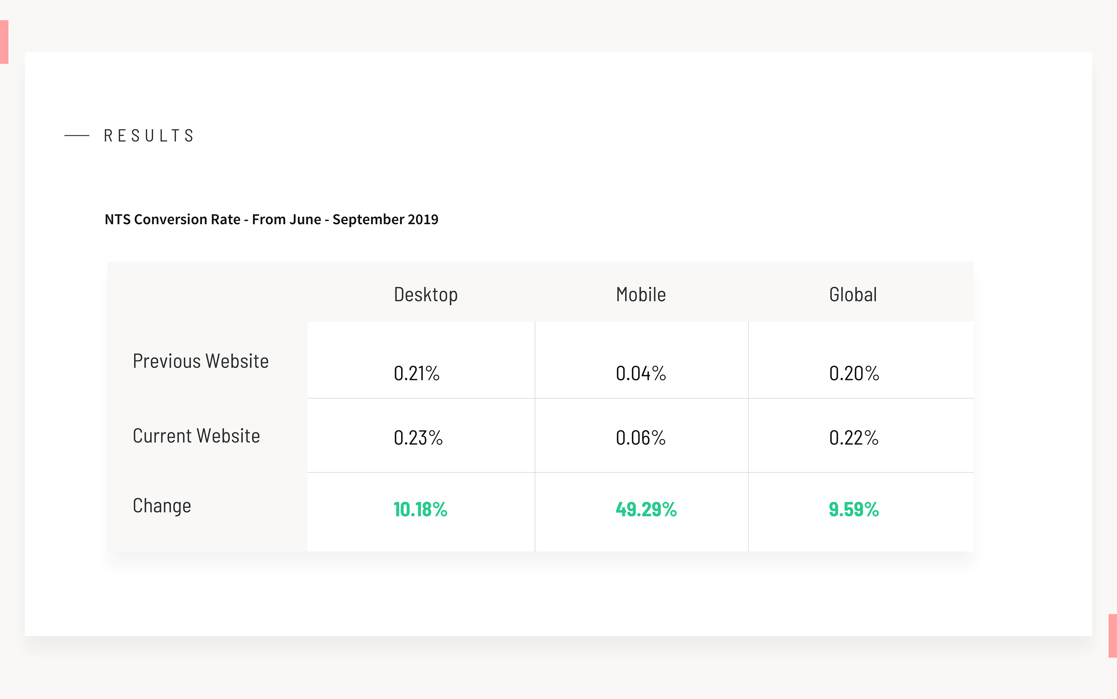
After launch, we kept a close eye on NTS to make sure there wasn't a drastic change that could bring negative effects. Overall the new brand and website refresh were received with excitement from our customers. Now we have an entirely new website where we can easily experiment and add new content to educate evaluators and customers on our product. We have tracking tools that give us data that can tell us what things require optimization and a better experience so that the website can be continuously updated and functional.
Thank you!
Visit Unbounce.com to see the new website